There’s a big difference between a business and a brand. It’s possible to build a brand identity, but the first step is understanding that you can build a business without a brand.
 Consider a simple lemonade stand a kid might setup in your neighborhood. If money transacts, it’s a business … but it’s not a brand.
When I use the word “brand” I am referring to the overarching identity of that business … not the business itself.
If you’ve ever been paid for side work or been sent a 1099 form for your taxes, you have a business (no matter how small). But if you want to promote that business, you must start thinking of branding.
To build a brand identity, consider these 3 sub-identities:
- Value Identity
- Visual Identity
- Verbal Identity
All three of these identities contribute to how you promote your business and how it’s perceived by the public. All three must align with one another if you want a cohesive brand position.
In this article you’ll see how I used this framework to create the brand identity for my conference Influence & Impact.
1. Value Identity
The first step is to determine how valuable a product or service is to the customer. So, I asked myself a question:
“What is the big problem I want to solve?”
My answer: “I have many influential friends who need to meet one another so they can partner to do great things. If I don’t do something, they’ll never meet and connect. That’s why I’m hosting this conference.”
Business is nothing more than solving a problem for a profit.
If you’re clear on the problem you want to solve, you’ll profit as long as you keep the revenue high and costs low. I wanted Influence & Impact to be of astronomical value to the attendees … in fact, I wanted it to border on being priceless.
[clickToTweet tweet=”Business is nothing more than solving a problem for a profit. Great branding case study.” quote=”Business is nothing more than solving a problem for a profit. “]I hate when speakers are the main selling point of an event because you can listen to speakers from the comfort of your own computer. Speakers, no matter how good, aren’t a competitive advantage.
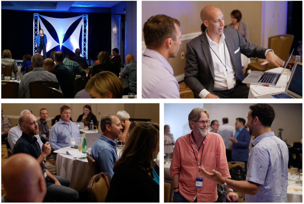
Any real leader knows the true value of an event is found in the side conversations during breaks, drinks, and dinner. Hello, selling point.
The quality of an event is in direct proportion to the quality of the people who attend, so I vetted the attendees by making sure that:
- I knew all the attendees personally.
- I invited all the attendees personally.
- I charged a high ticket price to position the value of the event properly.
Stop Competing on “What”, Start Competing on “Why”
If the big problem you’re trying to solve is your own cashflow, you’ll cap your impact. Launching a brand simply to make money relegates you to competing on “what” instead of competing on “why.”
 When you compete on “what” you’ll ultimately lose because your strategy peaks at padding your offering with more features, gizmos, and toys.
When you compete on “why” you have a mission. You have passion. You have a movement. You have something that people can emotionally connect to. Then, you must give people the language to use to describe that mission and movement.
During my opening remarks, I told people I wanted them to leave with three things:
- Belief
- Clarity
- Connections
I repeated those 3 things ad nauseum. It’s no surprise that people said those 3 things were exactly what they received by the end of the event. That’s intentional branding. Likewise, you must empower people with the language you want them to use to describe your work.
When marketing Influence & Impact, I told people, “Here’s the big problem I want to solve: I have a lot of high-caliber friends from different circles of life who need to meet one another. I’m going to do something about it. There are 2 or 3 people at an event I’m hosting that you need to meet. Will you come?”
Lean into the “big problem” — it will give you energy and clarity.
2. Visual Identity
Knowing the value identity makes it easy to approach the visual identity. Visual identity is more than just color scheme, typography, and photography. It’s about tone.
My designer Jason Clement created several color palettes, and I opted for blue and beige because that best reflected the audience I was trying to attract.
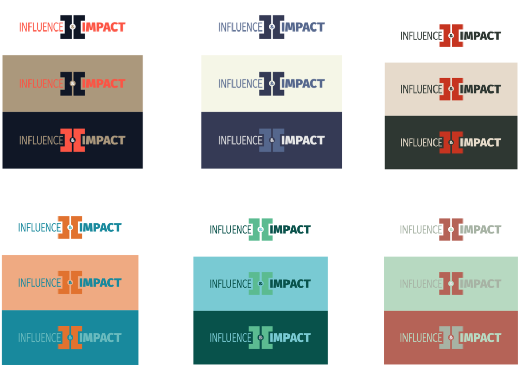
I really liked the tan and red palettes, but felt they would be over-the-top if those colors were on large signs throughout the venue. Did I really want a lot of red, which is associated with stopping, to represent an event that is all about progress? When evaluating designs, it’s wise to ask:
- Will this look good small?
- Will this look good large?
- Will the color be too intense if this is on a large sign?
The blue palette was soft, but dark enough to communicate trust. I also felt it would look appropriate in nearly any business hotel or venue.
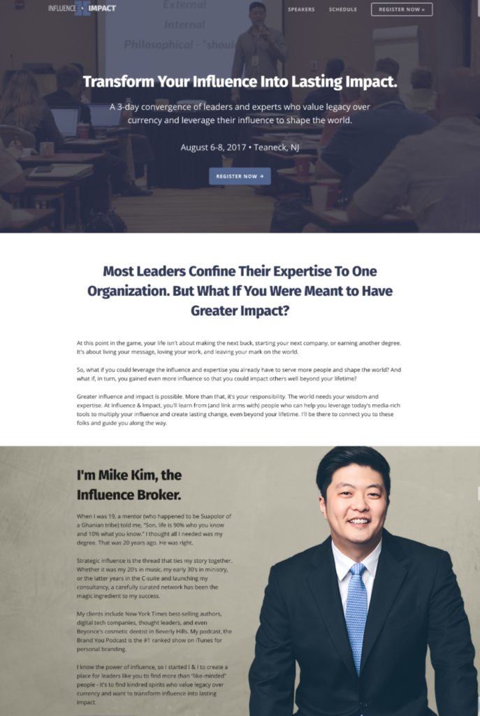 The Website: We chose of a photo of me in a suit (again, to set the tone) and used clean, crisp typography to convey the message.
The actual icon (the two “I’s”) are shaped like a door, which symbolize the open doors of opportunity that people would walk through from attending. (Remember, I wanted them to leave with belief, clarity, and connections.)
Though Jason and I have worked on numerous projects together, it’s still my job to give him direction.
Many business owners fall short when it comes to design because they can’t articulate what they want. They defer to comments like, “I want the look to be clean and simple.” Who wouldn’t? Those kind of remarks don’t help.
When brainstorming with Jason, I pitched the value identity to him from point #1 above. Then I told him, “I want the branding to look trustworthy, corporate yet inviting, and modern. I don’t want it to be stuffy or overly elegant.”
Finally, Signs: Signs were created last because print collateral is permanent. It’s possible to tweak a website on the fly, but once signs are ordered you can’t change them without paying.
Since we finished the value identity, color palette, and website, the signs were just a natural extension of all those things.
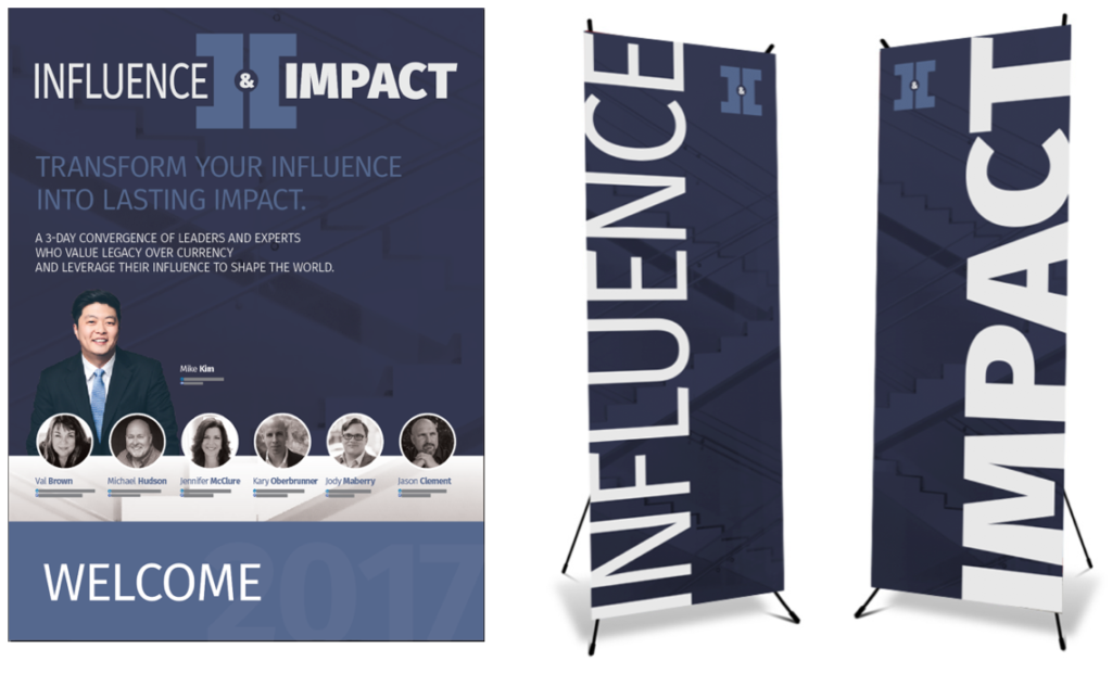
Because Jason knew the value identity of the brand and the big problem I was trying to solve, he was able to give Influence & Impact a visual identity that captured the essence of my vision.
3. Verbal Identity
Whether you write your own copy or hire a copywriter, the goal is to make your intended readers feel, “Wow, I’m in the right place!” The copy makes it very clear that I’m speaking to a successful professional who is looking for something “more” in life. I defined the “more” as (you guessed it) influence and impact.
Here’s some of the language I used:
- “At this point in the game, your life isn’t about making the next buck, starting your next company, or earning another degree. It’s about living your message, loving your work, and leaving your mark on the world.”
- “Greater influence and impact is possible. More than that, it’s your responsibility. The world needs your wisdom and expertise.”
- “I know the power of influence, so I started I & I to create a place for leaders like you to find more than “like-minded” people – it’s to find kindred spirits who value legacy over currency and want to transform influence into lasting impact.”
- “Influence & Impact is a convergence of influencers from the most important drivers of culture: business, healthcare, law, academia, media, entertainment, religion, and politics. Over the last fifteen years I’ve cultivated an incredible network of leaders who treasure legacy over currency and generously invest in others.”
- “But more than that I & I is about experts, influencers, and leaders coming together. Don’t bother bringing your business cards — I won’t allow them! This is about creating meaningful connections that will take your impact to new heights.”
When writing the verbal identity of a brand, be specific enough to be believable and universal enough to be relevant.
[clickToTweet tweet=”When writing brand copy: be specific enough to be believable and universal enough to be relevant.” quote=”Be specific enough to be believable and universal enough to be relevant.”]Note that I stated what types of people would be there: “business, healthcare, law” and so forth. I repeatedly use the words “experts, influencers, and leaders” and convey the promise of connection by using phrases like “find kindred spirits” and “meaningful connections.”
I did not say, “Hey guys, come to this AH-MAZING conference! We’re gonna eat, drink, hear from powerful speakers, and you’ll get soooooooo connected with other like-minded people!” That’s not how my intended audience talks … that’s how the teenagers of my intended audience talks!
Your brand needs to “talk” the correct way.
Value Identity + Visual Identity + Verbal Identity = Brand Identity
When you merge the value identity, price tag, and visual branding with the correct language, you have a crystal clear brand identity.
When there’s a breakdown in one, there’s a breakdown in all. Terrific copywriting on a crappy looking website that charges $3000 for a ticket wouldn’t work. Great design with teenage-type copywriting wouldn’t work, either.
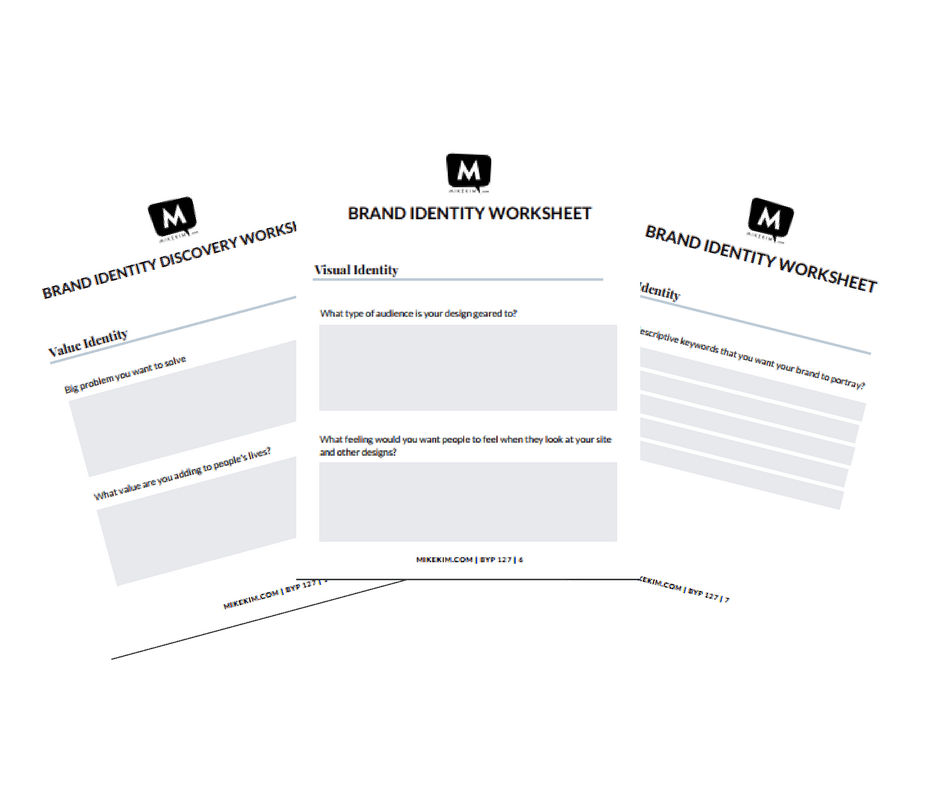
This is a lot to take in, so I’ve created a free resource for you to use based off the content in this post. Happy branding!
FREE DOWNLOAD: Brand Identity Discovery Worksheet
